

Table of Contents
You are running ads. Traffic is arriving. The form is empty.
This is the most common frustration for business owners in Chennai and across India who have invested in Google Ads or Meta campaigns, only to watch visitors land and leave without making contact. The instinct is to blame the ads. More often, website mistakes killing conversions are the actual cause, and they are structural, not cosmetic.
A website does not fail dramatically. It quietly loses people at predictable friction points, visitor after visitor, that are entirely fixable once you know where to look. These seven website mistakes killing conversions account for most of that loss, and understanding each one is the first step toward fixing a site that is attracting traffic but not converting it. Each section includes a specific fix. The final section is a 7-step self-audit you can run in under an hour using free tools before calling anyone.
Why Your Website Is Losing Leads Before Anyone Reads a Word
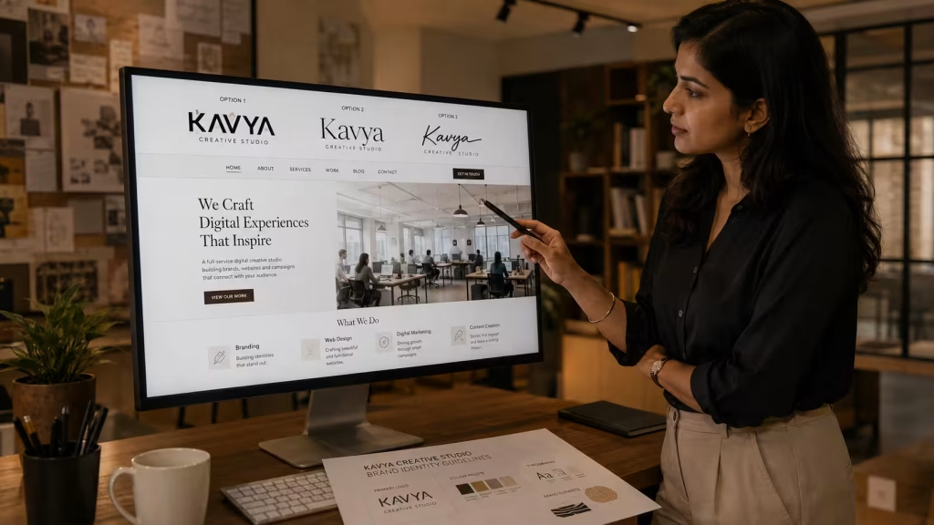
Most conversion advice starts with headlines, CTAs, and form fields. Those things matter, but they arrive too late in the diagnostic sequence. The first filter a visitor applies is visual, and it takes under a second. If the page looks inconsistent or generically assembled from stock parts, the subconscious verdict is already in before the conscious mind has read a sentence.
A website built without a defined visual identity (no locked colour system, no consistent type scale, no clear photography direction) signals that the business itself may not be quite ready. Visitors who arrived with commercial intent do not consciously think “this brand is inconsistent.” They feel uncertain, and uncertain visitors do not fill in forms. Consistent branding and visual identity work is where conversion-focused web design actually begins, not at the wireframe stage. Among the website mistakes killing conversions quietly on otherwise well-funded sites, this is the most overlooked.
Picture a manufacturer in Tamil Nadu who just launched a Google Ads campaign. Click-through rates look healthy. But the landing page uses three different logo versions, a stock photo of a Western office, and a headline that reads “Your Growth Partner.” The visitor cannot tell what the business makes or where it operates. The form stays empty, and the media spend is wasted. That is a brand trust problem, and it shows up in the bounce rate long before it shows up in a lead count.
Mistake 1: Your Above-the-Fold Message Does Not Answer the Right Question
Among the website mistakes killing conversions silently and expensively, an unclear hero message ranks first by impact. The first question every visitor asks is not “is this company good?” It is “is this for me?” That question must be answered in the hero section, above the fold, within five seconds of arrival. A visitor who cannot self-identify as the right customer within that window will leave before scrolling, and no content below the fold will retrieve them.
The failure pattern is specific. A headline like “Innovative Solutions for Modern Businesses” tells the visitor nothing about who the business serves, what it does, or what happens next. The fix is equally specific: the hero headline states what the business does, for whom, and with what outcome. “We design packaging systems for FMCG brands across South India” is not elegant, but it converts. The visitor knows in two seconds whether to stay.
Supporting copy in the hero should answer the second question: “why you?” One concrete proof point, whether that is a named client, a completed project count, or a years-of-experience figure, outperforms three paragraphs of aspirational language. Make the primary CTA the only interactive element above the fold. One question, one answer, one action.
Mistake 2: Slow Page Speed Is Costing You Visitors Who Never Come Back

Page speed is not a technical nicety. It is the first experience a visitor has of your brand, before they see your logo, read your headline, or evaluate your offer. A page that loads slowly communicates, at a visceral level, that the business does not take performance seriously. Over 53% of mobile visitors will abandon a site that takes longer than three seconds to load, according to Google’s research on mobile page speed.
Google’s Core Web Vitals framework provides three measurable thresholds for page experience that Google uses as a ranking signal. Every business website should know its scores against all three metrics. For Indian businesses where most traffic arrives on mid-range Android devices over 4G connections, the performance bar is both more important and harder to clear than it is for a desktop-first audience on fast broadband. Page speed sits among the website mistakes killing conversions that have a direct and measurable effect on Google search rankings as well as visitor behaviour.
What Google’s Core Web Vitals Actually Measure
| Metric | What It Measures | Good Threshold | Common Cause of Failure |
|---|---|---|---|
| LCP (Largest Contentful Paint) | How fast the main content loads | Under 2.5 seconds | Unoptimised hero images, slow hosting |
| INP (Interaction to Next Paint) | How fast the page responds to user input | Under 200ms | Heavy JavaScript, third-party scripts |
| CLS (Cumulative Layout Shift) | How stable the layout is as it loads | Under 0.1 | Images without declared dimensions, late-loading fonts |
The most common cause of poor LCP on Indian business websites is an uncompressed hero image served from shared hosting with no content delivery network. Fixing the image compression and upgrading the hosting tier addresses the majority of LCP failures without rewriting a single line of code. INP failures are almost always caused by third-party script bloat: chat widgets, analytics tags, retargeting pixels all loaded simultaneously on page arrival. CLS failures are usually images loading without reserved space, causing the layout to jump as they arrive.
Mistake 3: Your Navigation Makes Visitors Work Too Hard
Navigation has one job: get the visitor to the information or action they came for, with the fewest possible decisions. When it fails that job, both costs are invisible unless you are watching session recordings or tracking drop-off by page.
Navigation is one of the website mistakes killing conversions most reliably on otherwise well-designed sites. The most common failure on Indian SMB websites is the overcrowded top menu. Eight or more top-level items, each with a dropdown sub-menu, creates a decision tree that visitors abandon rather than navigate. If a visitor cannot reach any key page within two clicks, the navigation architecture needs restructuring.
The second failure is hiding the primary CTA as plain text that looks identical to “About” and “Services” in the nav bar. Colour, weight, and placement must make the CTA visually distinct from every other navigation element. These are among the website mistakes killing conversions that are invisible in a desktop preview but obvious the moment you watch a real session recording.
Mistake 4: You Have One CTA Too Many, or None at All
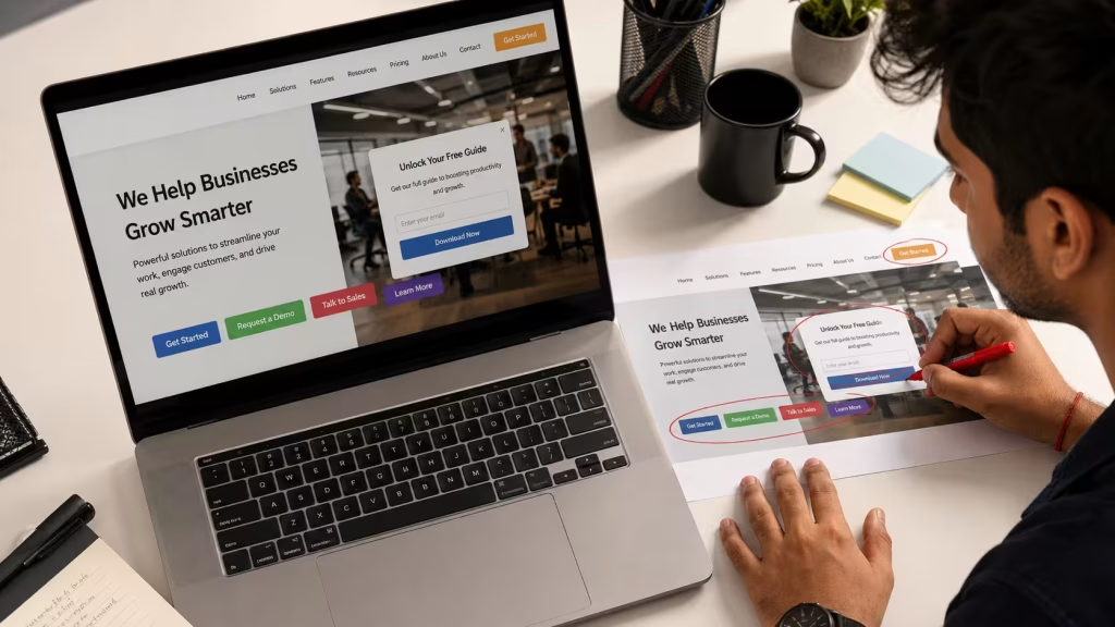
When a visitor arrives on a page with four or five competing actions, the most common outcome is inaction. The brain defaults to doing nothing rather than choosing incorrectly. This is the pattern that shows up when businesses audit their bounce rates alongside their on-page CTA count.
The opposite failure is equally common. A page that describes a service thoroughly but never directs the visitor to a next step is a brochure, not a conversion tool. The visitor reads, is interested, and closes the tab. The business never knew they were there.
The fix is structural. One primary CTA per page, placed above the fold, once mid-page, and once at the bottom. The CTA text describes a specific outcome, not a generic action.
| Pattern | Example | Why It Fails |
|---|---|---|
| Vague verb | “Click Here” | Gives no information about what happens next |
| Competing CTAs | Four buttons above the fold | Creates decision fatigue, visitor acts on none |
| No CTA | Long service description, no next step | Visitor reads, then leaves with no path forward |
| Strong primary CTA | “Request a Project Scope” | One action, specific outcome, low commitment |
A CTA is not a button design problem. It is a clarity problem. The button is just the last step in making the decision feel easy. Competing or absent CTAs are among the website mistakes killing conversions that businesses consistently overlook.
Mistake 5: Your Website Fails on Mobile Before the Page Finishes Loading
Mobile-first is the baseline expectation for any Indian business website in 2026. Google indexes the mobile version of a site first when deciding where to rank it. A website that works well on a laptop but breaks on a phone is not a minor inconvenience. It is the version most of your visitors and all of Google’s crawlers actually see.
The website mistakes killing conversions on mobile are specific and recurring. CTAs that are full-width on desktop collapse into small unreadable buttons on mobile. Navigation menus that work on a large screen become impenetrable hamburger menus requiring multiple taps. Text that is comfortable at 1400px becomes unreadably small at 375px. Touch targets too close together cause accidental taps that disorient visitors. These are website mistakes killing conversions on mobile that never show up in a desktop preview session.
The audit is simple: open your website on a mid-range Android phone on a 4G connection, not on office WiFi, and try to complete the journey you want a customer to complete. Every extra tap, every moment of confusion, and every layout element that is hard to interact with represents a visitor who left instead of converting. Google’s Core Web Vitals documentation gives the technical criteria your mobile site is evaluated against.
Mistake 6: Poor Colour Contrast Is Quietly Excluding Visitors
Colour contrast carries two separate costs simultaneously. The first is accessibility. WCAG 2.2 Level AA requires a contrast ratio of at least 4.5:1 between body text and its background, and 3:1 for large text and interface components such as buttons and form fields. Many brand palettes built for print fail this threshold when applied directly to a white web background.
The second cost affects every visitor. Low contrast text creates reading friction regardless of whether the reader has a visual impairment. A light grey heading on a white background looks minimal in a mockup and invisible on a mobile screen in natural light. Visitors do not think “the contrast ratio is insufficient.” They think “I cannot read this” and they leave.
Push Digital has been building brands out of Chennai for more than 25 years, and a recurring pattern in brand refresh projects is a palette designed for print collateral and applied directly to a web build without a contrast audit. The result is a website that is neither accessible nor readable, and fixing it requires reworking both the identity guidelines and the live site. Checking the palette against WCAG 2.2 thresholds before the brand guidelines are signed off removes the problem entirely, which is why the accessibility check belongs at the identity design stage, not the build stage. Leaving it until build is one of the website mistakes killing conversions and accessibility simultaneously.
Mistake 7: Your Contact Form Is the Last Obstacle Between You and a Lead
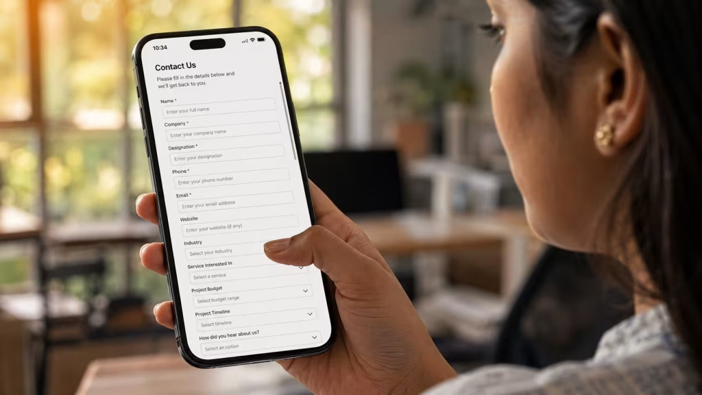
A contact form is the final conversion gate. Every unnecessary field, every missing error message, and every absent confirmation state is a visitor who stopped at the last step and walked away. Most businesses treat the form as a formality. It is where the actual conversion decision is made.
Picture a B2B company whose enquiry form asks for name, company, designation, phone, email, turnover, headcount, and a 200-word project description. The visitor fills four fields, sees what remains, and closes the tab. The business never receives the enquiry.
Form length should match the commitment level the visitor has reached at that point in the journey. A first-contact enquiry form needs a name, a phone or email, and one open-field question. Three to five fields is the working range for a service business.
Beyond length, three form failures destroy conversions reliably: no real-time validation so errors only surface on submission, no specific error messages so the visitor cannot fix what went wrong, and no confirmation state so the visitor does not know whether the form submitted. Each of these is solvable in any web platform without a rebuild. All three are website mistakes killing conversions at the final stage of a journey that may have cost real money to build.
How to Diagnose Your Own Website Before Calling an Agency
Before engaging a web design and development service to address website mistakes killing conversions on a live site, a business owner can run a structured self-audit using free tools in under an hour.
A 7-Step Self-Audit Checklist
- Run a Core Web Vitals check. Open Google PageSpeed Insights and enter your homepage URL. Switch to the Mobile tab. Note LCP, INP, and CLS scores. Any score in red or amber is a priority fix.
- Check your above-the-fold message. Look away for five seconds, then ask whether a stranger could identify what the business does, for whom, and what the next step is. If any answer is no, the hero needs rewriting.
- Count your above-the-fold CTAs. If there is more than one, decide which is primary and visually demote the others.
- Test on a mid-range Android phone over 4G. Not your iPhone, not office WiFi. Complete the journey you want customers to complete. Note every friction point.
- Check your body text contrast. Use the free WebAIM Contrast Checker. Enter your body text colour and background colour. A ratio below 4.5:1 fails WCAG 2.2 Level AA.
- Count your navigation items. More than seven top-level items, or more than two clicks to any key page, signals a restructuring need.
- Submit your own contact form. Note the field count, whether validation is real-time, whether error messages are specific, and whether a confirmation appears. Fix every no.
Run this audit quarterly. Websites lose performance over time as scripts accumulate, content grows, and platform specifications change. The Push Digital portfolio includes web projects where this audit found the fixable issue before a full rebuild was commissioned.
Conclusion
The seven website mistakes killing conversions covered in this article share one characteristic: none of them announce themselves. They work quietly, across every visitor session, accumulating into a conversion rate that looks low and a lead count that does not match the traffic the business is paying to attract.
The action for this week: run the 7-step self-audit above. Start with the Core Web Vitals check and the above-the-fold message review.
If the audit reveals structural performance problems, a navigation architecture that needs rebuilding, or a brand identity that is inconsistent across the site, get in touch with our team to discuss what a structured web review covers. Our portfolio of client work shows what the process looks like in practice.
Frequently Asked Questions
What website design mistakes hurt conversions the most?
The three highest-impact mistakes are an unclear above-the-fold message, slow mobile page speed, and a contact form with unnecessary fields. These three website mistakes killing conversions account for the majority of recoverable lead loss on most Indian SMB websites.
Why is my website getting traffic but no leads?
Traffic without leads is one of the clearest signs of website mistakes killing conversions rather than a traffic quality problem. The page attracts the right visitors but fails to convert them. The most common causes are a hero section that does not confirm the visitor is in the right place, a CTA competing with other actions on the page, and a contact form that creates too much friction at the final step.
How do I know if my website is losing conversions?
A bounce rate consistently above 70% on mobile, average time on page below 30 seconds, and traffic that does not translate into form submissions are the primary signals. Google Search Console shows where visitors drop off by page, and Google PageSpeed Insights shows whether performance is the underlying cause.
What is a good conversion rate for a business website?
For B2B service businesses, a conversion rate of 2–5% on organic traffic is a realistic working benchmark. Paid traffic typically sees 1–3%, depending on how closely the landing page matches the ad’s intent. These figures vary by industry, offer type, and traffic quality, and should be tracked month on month against the same traffic sources.
How does page speed affect website conversions?
Page speed is one of the website mistakes killing conversions at two simultaneous levels. Directly, visitors who wait too long abandon before the page loads at all. Indirectly, Google’s Core Web Vitals scores (LCP, INP, and CLS) influence where the page ranks in search results, which affects how many visitors arrive and how qualified they are when they do.
Does website design affect SEO rankings?
Yes. Google’s Core Web Vitals are explicit ranking signals within the Page Experience evaluation. A site with poor LCP, INP, or CLS scores is ranked lower than a comparable site with good scores. Mobile responsiveness and HTTPS are also confirmed ranking factors. Design decisions made at build stage directly determine