Table of Contents
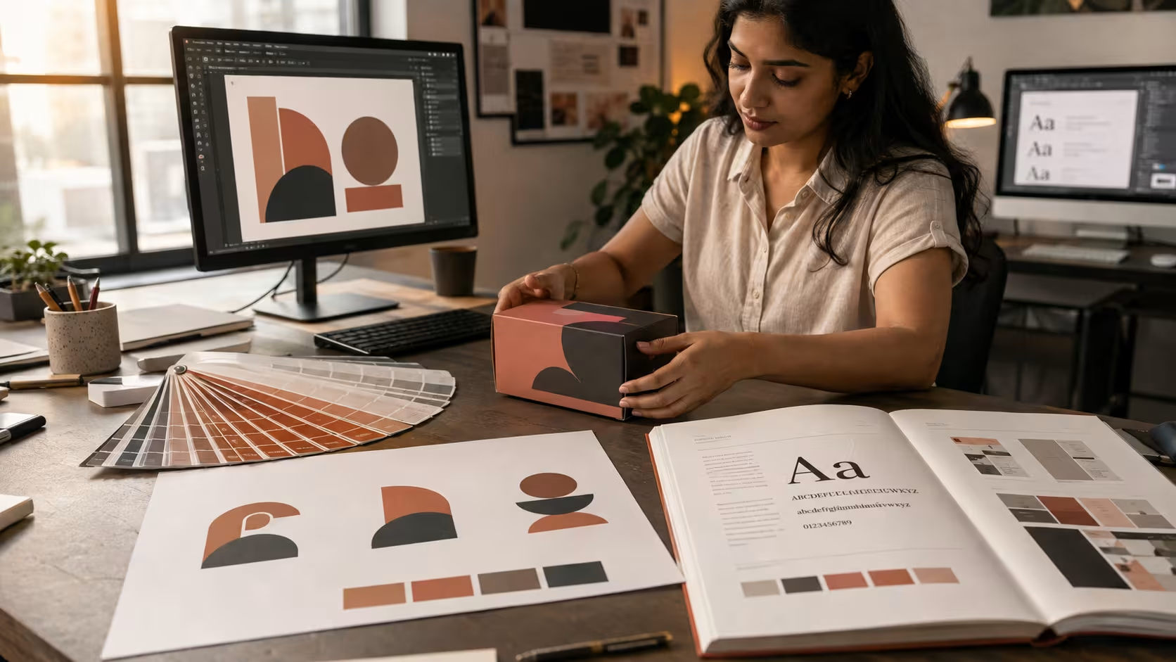
A Chennai startup founder spends three weeks and a modest budget on a new logo, then launches a website, an Instagram page, and a packaging run that all look like they belong to three different companies. The logo was never the problem. The absence of brand identity design was. Brand identity design is the complete system of visual and verbal rules, logo, colour, typography, imagery, and voice, that keeps a business looking and sounding like one company across every place a customer meets it. A logo is one asset inside that system, not a stand-in for it.
What a Logo Actually Does

A logo is a single graphic mark, a wordmark, symbol, or combination of both, built to be recognised at a glance. It does one job: identification. It does not define colour rules, typography, or tone of voice, which is why a business can own a strong logo and still look inconsistent everywhere else it shows up.
Most business owners treat the logo as the finish line. It is the starting asset, not the system. A logo tells a customer who made this. It says nothing about how the product photography should look, what the Instagram captions should sound like, or which secondary colour goes on a packaging insert when the primary brand colour would not print correctly on that stock.
A good logo still has to earn its place. It needs to work at the size of a favicon and the size of a hoarding, in a single colour and in full colour, without losing legibility either way. Designers test a mark against these constraints before it ships, because a logo that only works at one size or on one background will eventually be misused, and every misuse chips away at recognition rather than building it.
Picture a Chennai bakery that commissions a clean, well-drawn logo from a freelance designer for a reasonable fee. The logo looks sharp on its own. Then the owner picks packaging colours by eye, a relative designs the Instagram templates in a completely different font, and the delivery boxes carry a third colour scheme entirely. Every touchpoint identifies the business correctly. None of them feel like the same business, because no rule ever said they had to match.
This is not a failure of the logo. The logo did exactly what it was designed to do. The gap is everything the logo was never asked to define: which typeface goes on a delivery box, which secondary colour supports the primary one, and what tone the captions should take when the bakery posts a festival offer versus a routine product shot. Those decisions belong to brand identity design, not to the mark itself.
What Brand Identity Design Covers Beyond the Logo
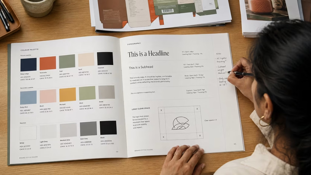
Brand identity design is the documented system of logo, colour palette, typography, photography direction, and usage rules that keeps a business consistent across every channel it operates on. It ships as a style guide with exact colour values, type scales, and logo clear space rules. Without that documentation, the same logo looks correct on a business card and slightly wrong on a website.
The gap between a logo and a full identity system shows up fastest in production. A print vendor needs exact CMYK values for packaging. A social media manager needs a documented type scale so headline sizing does not drift post to post. A web developer needs HEX codes that match the physical brand exactly, not an eyeballed approximation pulled from a JPEG of the logo. Brand identity design answers all three questions once, in writing, so nobody re-decides them project by project.
A style guide produced through proper brand identity design usually documents primary and secondary logo lockups, minimum clear space around the mark, an approved colour palette with exact values for print and screen, a type scale covering headlines through body copy, and a short set of misuse examples showing what not to do with the logo. That last section matters more than it sounds. Showing a designer what a stretched, recoloured, or cluttered version of the logo looks like prevents far more inconsistency than simply handing over the correct file and hoping for the best.
Logo Design vs Brand Identity Design: Side by Side
| Element | Logo Design | Brand Identity Design |
|---|---|---|
| Core deliverable | Single graphic mark | Full visual and verbal system |
| Colour specification | Not defined | Exact HEX, RGB, CMYK values |
| Typography | Not defined | Full type scale and font pairing |
| Documentation | None | Style guide with usage rules |
| Photography direction | Not covered | Defined mood, angle, lighting style |
| Voice and tone | Not covered | Documented messaging guidelines |
| Consistency across channels | Not guaranteed | Built into the system |
Push Digital’s brand identity and visual identity work treats the logo as one component inside this larger system, never as the deliverable on its own.
Why This Confusion Costs Businesses Money and Time

Confusing a logo with a complete identity system is expensive because it forces every new asset to be designed from scratch, without a rulebook. A packaging designer, a social freelancer, and a web developer working from a logo file alone will each make separate colour and typography decisions. Six months later, three teams have produced three different-looking versions of the same brand.
The Advertising Standards Council of India requires that objective claims made in advertising be capable of substantiation, and the same discipline applies to visual consistency even though it is not a legal requirement. If a business claims a premium positioning through its messaging but its packaging, website, and social presence all look like different companies, the inconsistency itself undermines the claim before ASCI or anyone else gets involved. Read the full ASCI Code for Self-Regulation for the substantiation standard that governs how advertising claims are expected to hold up.
Push Digital has been building brands out of Chennai for more than 25 years, and the pattern that repeats across rebrand enquiries is almost always the same: the client arrives with a logo they like and a set of marketing materials that do not agree with each other or with it. Fixing that after the fact costs more than building the system correctly the first time, because every mismatched asset has to be redesigned rather than generated from an existing rule.
There is a slower cost too, one that does not show up on an invoice. Every time a customer sees a slightly different version of the same brand, they have to re-identify it before they trust it. A shopper who saw one colour palette on Instagram and a different one on the packaging at a store spends an extra half second deciding whether this is the same business they follow online. That hesitation is small once. Repeated across every touchpoint, it is the reason some brands never build the instant recognition their competitors do, even with a comparable marketing budget.
The Brand Identity Design Process, Stage by Stage
Brand identity design runs through a defined sequence: discovery and positioning, concept development, and refinement into a documented system. Discovery clarifies who the business serves and how it wants to be perceived. Concept development turns that positioning into visual options. Refinement locks the chosen direction into a usable style guide.
- Discovery and positioning. Define the target audience, the direct competitors, and the personality the brand needs to project before any visual work starts.
- Concept development. Explore logo directions, colour palettes, and typography options that express the agreed positioning, not just what looks appealing in isolation.
- Refinement and system build. Narrow to one direction and build out the full system: logo variations, colour values, type scale, photography direction, and usage rules.
- Documentation. Compile everything into a style guide so any designer, printer, or vendor can apply the identity correctly without re-asking basic questions.
Skipping straight from a logo brief to production is the single most common shortcut that leads back to the inconsistency problem described earlier, because concept development and documentation are the stages that actually produce the rules everything else depends on.
How Push Digital Structures This in Chennai
Push Digital runs this sequence for businesses across Chennai and Tamil Nadu, treating the logo as the output of the concept development stage rather than the starting brief. A style guide typically documents primary and secondary logo marks, an exact colour palette in HEX, RGB, and CMYK, a type scale for headings and body text, and photography or illustration direction specific to the industry. Browse recent brand identity projects to see how this plays out across different sectors.
Do You Need a Logo or a Full Brand Identity Right Now

A new business testing an idea before committing budget can often start with a logo alone, provided it accepts the visual system will need to be built later. A business already producing packaging, running paid social campaigns, or preparing for investor conversations needs brand identity design from the outset, because inconsistency at that stage is visible to the exact audience whose trust matters most.
Choose a logo alone when:
- The business idea is still being validated and budget is genuinely constrained
- There is no packaging, paid advertising, or investor material planned in the next few months
- The founder accepts that a fuller identity system will be a near-term follow-up project
Choose brand identity design when:
- Packaging, signage, or paid social campaigns are already in production
- More than one person or vendor will be creating brand assets
- The business is preparing for a funding round, a franchise model, or multi-city expansion
The decision usually comes down to how many hands will touch the brand next. One founder designing their own Instagram posts can survive on a logo for a while. Three vendors producing three different assets cannot.
There is a middle path many businesses miss: a lighter identity system built alongside the logo from day one, covering just the colour palette, one primary typeface, and a short set of usage rules, without the full photography direction or messaging framework a mature brand eventually needs. This costs less than a complete system and still stops the packaging, social, and website versions of the business from drifting apart in the first six months, which is exactly the window when most of the inconsistency described earlier actually happens.
What Drives the Cost Difference
Brand identity design costs more than a logo alone because the deliverable is larger: strategy, visual explorations, a full colour and type system, and a documented style guide, not one graphic file. The price difference reflects the number of deliverables in scope, not agency size, which is why a clear scope breakdown matters more than a quoted number on its own.
Four factors move the price most: the number of logo concepts explored before one is chosen, whether positioning research is included or the client arrives with positioning already defined, how many stakeholder review rounds are contracted into the process, and whether production-ready files for print and packaging are part of the final handover. A brand identity design project that skips positioning research and delivers only digital files will always cost less than one that includes stakeholder workshops and print-ready packaging artwork, because the scope itself is smaller.
None of these four factors are hidden once a business knows to ask about them. A vendor quoting for logo design alone should be able to say exactly that: no positioning research, one round of revisions, digital files only. A vendor quoting for full brand identity design should be able to list the same four factors with a number attached to each one, concept count, research scope, review rounds, and file handover, so the client can see precisely what the higher figure is paying for instead of taking a lump sum on faith.
Web Content Accessibility Guidelines 2.2 Level AA requires a text contrast ratio of at least 4.5 to 1 for body copy, though WCAG 2.2 specifically exempts logo wordmarks from this requirement. That exemption does not extend to the rest of a brand identity system: website body text, packaging copy, and app interfaces built on the brand’s secondary colours still need to clear that ratio, which is one more reason a documented palette with tested colour combinations is worth building properly rather than eyeballing later.
Timeline is the other lever business owners underestimate. A logo alone can realistically be concepted and finalised within a couple of weeks once positioning is clear. A full brand identity design project runs longer because concept development and documentation both take real working time: colour combinations have to be tested against packaging stock and screen rendering, typography has to be checked across headline and body use, and the style guide itself has to be written clearly enough that a vendor who has never met the brand can follow it correctly. Rushing the documentation stage to hit a shorter timeline is usually where inconsistent execution starts.
Conclusion
Logo design and brand identity design solve different problems, and mixing them up is the single most common mistake business owners make before their first rebrand conversation. A logo identifies. Brand identity design documents the full system, colour, typography, photography, and voice, that keeps a business consistent everywhere a customer encounters it. If packaging, campaigns, or vendor handoffs are already in motion, this week’s action is simple: audit whether your current colour values and typography are actually written down anywhere, or whether every new asset is still being eyeballed against an old logo file. Talk to our brand team about building the documented system your logo has been missing.
Frequently Asked Questions
What is the difference between a logo and a brand identity?
A logo is one graphic mark used for recognition. Brand identity design covers the full system: colour, typography, photography direction, and documented usage rules across every channel.
Is a logo the same as a brand?
No. A brand is how customers perceive a business over time. A logo is a visual asset, and brand identity design is the documented system that supports that perception consistently.
What does brand identity design include besides the logo?
It includes a colour palette with exact values, a typography scale, photography direction, tone of voice guidelines, and a style guide documenting how to apply all of it correctly.
Do I need a logo or a full brand identity for a new business?
Early-stage businesses with no packaging or paid campaigns yet can often start with a logo. Businesses already in production or preparing for investors need the full system sooner.
How much does brand identity design cost compared to just a logo?
Cost scales with scope: concept count, whether positioning research is included, review rounds, and whether print-ready files are part of the handover. More deliverables means a higher price.
How long does a brand identity design process take?
Timelines vary by scope, but the process typically runs through discovery, concept development, and refinement before a documented style guide is delivered for the business to actually use.